
Reference
Light and dark themes
Choose the extension theme, understand the system-color fallback, and keep dense tab lists readable.
Switch to DeutschThis version provides light and dark popup themes. Theme selection changes the extension interface, not the content or color scheme of open web pages.
Theme options
The light theme uses bright neutral surfaces with dark text. The dark theme uses dark neutral surfaces with light text. Both retain the violet-to-blue product accent and semantic status colors.
Native Chrome Tab Group colors use a separate palette from popup surfaces and custom group gradients. A group can therefore look different between the extension popup and Chrome's tab strip.
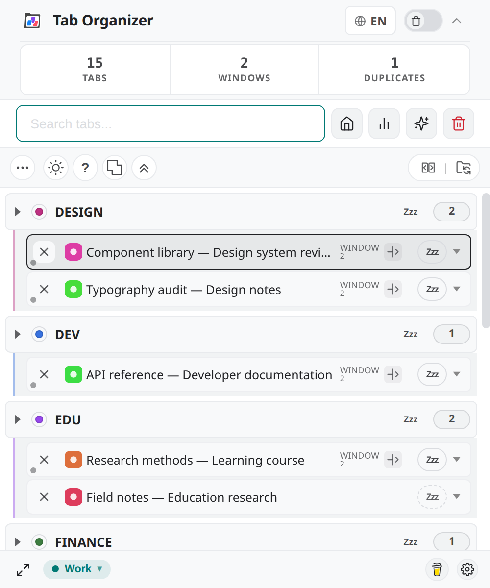
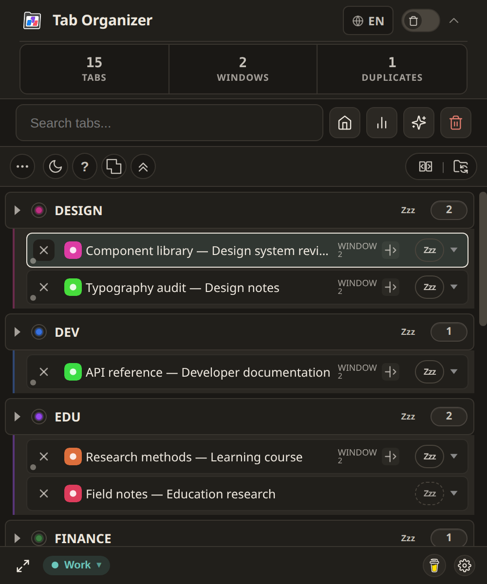
Choose a theme
- Open Tab Organizer.
- Select Switch light/dark mode.
- Check the header, group labels, tab rows, dialogs, and status indicator.
- Select the toggle again to return to the other theme.
The extension stores theme and view state in browser extension storage so the popup can reuse the selected appearance.
System setting
When there is no applicable saved choice, the popup styling can use the browser's prefers-color-scheme result as a fallback. Change the operating system's light or dark appearance, then reopen the popup to test that initial behavior.
After you make an explicit in-extension choice, use the extension's toggle to change it again. A website theme and the extension popup theme are independent.
Readability
Choose the theme that gives you the clearest tab titles, group colors, focus outlines, and warning states in your environment. Do not rely on color alone: SYNC, MIRROR, button labels, counts, and expanded or collapsed states also communicate status.
You can resize the popup when long titles are difficult to distinguish. Resizing does not change the browser's text zoom or your operating system's accessibility settings.